When you consult with a graphic designer for your print project, they will need your logo, photos and other digital art (or assets) to produce the finished piece. Moreover, to save both time and money, the files you provide should be what’s called “print ready artwork.” But what does “print ready” really mean in terms of your project?
When you hand your graphic designer poor quality art, they must recreate it, which takes additional time that isn’t likely provided for in your estimate. And, it’s your designer’s job to make sure your brand will appear the best it can be, and they cannot produce a high-quality product without the correct images, files or assets in the correct format with suitable specifications.
Not only does poor quality frustrate your designer, but you will be disappointed with the final printed product. Moreover, your designer will be disappointed to hand you a poorly printed product. It’s not only embarrassing for you, but for the graphic designer as well! Who wants to hand out poor quality business collateral with their name attached to the pieces?
When you first consult with a designer, they likely will briefly discuss print ready art and what goes into ensuring a file is ready to print. Your designer needs to learn about and review your files, so they can plan accordingly and provide an accurate estimate for your printed product.
As the client, your biggest challenge is determining if your art is print ready and if your designer will readily accept it. In this guide, we will help you figure out exactly what the term “print ready artwork” means and how to determine if your art is indeed ready to print.
What Does ‘Print Ready Artwork’ Actually Mean?
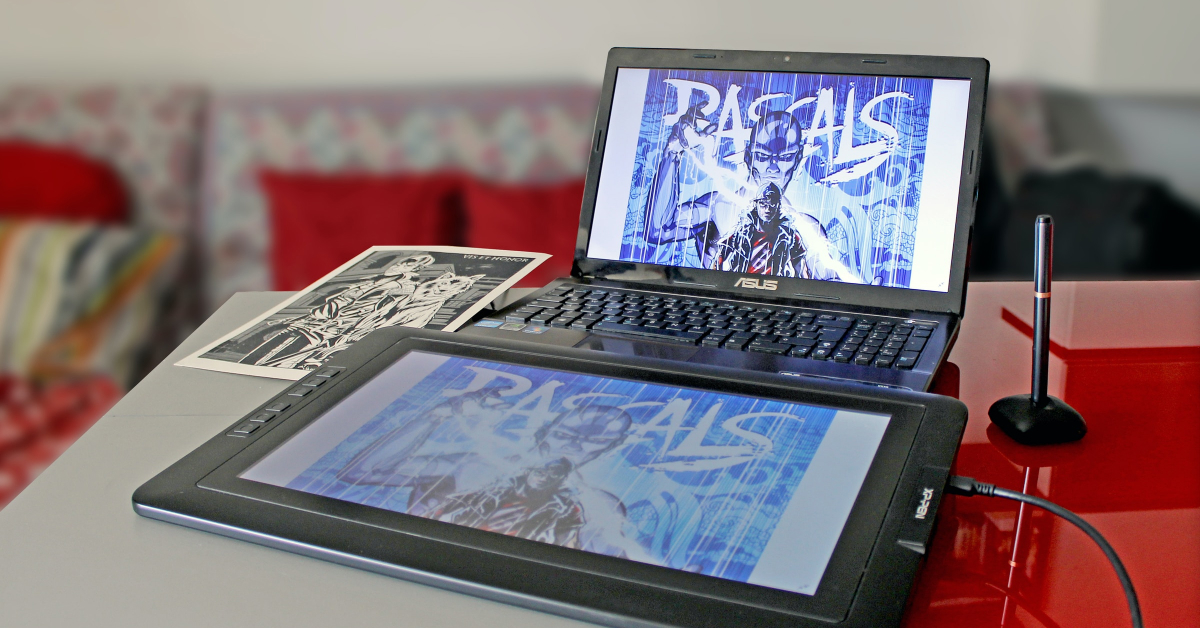
Print ready art, sometimes also called ‘press ready,’ is any file or asset that you provide your graphic designer or printer that is high quality and will not pose any issues when the final layout is ready to be printed. If your art is not print ready, it could result in extra expense and reprints. Any good graphic designer or printer will be able to quickly tell if your art isn’t up to snuff. Bringing your art to “print ready” format almost certainly adds time, and more time adds unnecessary cost to your project – especially if you’re in a hurry and your art isn’t suitable for printing.
Explain the Full Scope of Your Project

For example, once a client asked me to recreate an old image into a print ready image. After asking some questions about the project, I gave the client the final dimensions, DPI and color modes required for the final image. After a few days, the client reached out, wondering why the art they supplied would not print well on a banner. I tried to explain that since he had failed to mention that the image would print on a banner that I had not designed the layout for a banner. I tried to explain that his image (a rasterized image) would never be suitable for a banner. We discussed the somewhat complex technical reasons as to why this would be impossible, details that we’ll discuss more later. In fact, the final print ready banner image’s file size would be so huge that it would be a nightmare for other designers or printers to handle. Using an image to design a business card has very different design considerations from the requirements for designing a banner.
In the world of printing, a good way to think about art is to “go big or go home,” which means that if you think that your design will ever be printed in a large format, tell your designer upfront. It will save tons of time down the road when all of a sudden, for example, you must have the logo on your business card printed on a banner.
So, the short story is that you always should tell your designer how you intend to use the final design. It will help them make informed decisions when estimating and designing your project.
Resolution, DPI and the Final Printed Size
Do you remember when we mentioned “complex technical reasons” for supplying all your images in the correct size and format for your designer? Let’s discuss those reasons. For any printed project, it’s very important to consider the final size of any art you provide your designer. Will your art be featured as a cover image, using the entire printable area, or will it be used as a small photo inline within an article?
Knowing how your art will be used is important for your designer to determine if your art is print ready. For example, a small .jpg sized to 1500 by 1500 at 150dpi is ideal when used as an image for an article, but when used as a cover image, it will experience issues.
At the end of the day, your designer always needs the highest-quality art you have. This gives your designer greater flexibility when designing your project, because high-quality art has the flexibility to be used anywhere within a project.
Raster Images vs. Vector Art: Understanding the Difference
Understanding the difference between raster images and vector art is a huge help when determining if your art is print ready.
Raster Images
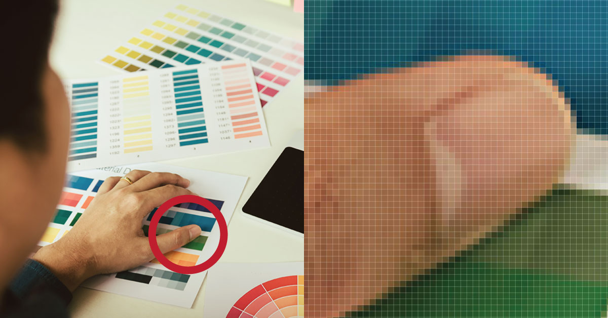
Think of raster images like photos. They are made exclusive of pixels, which has important considerations when printing. Your rasterized image often ends with a file extension such as “.jpg,” “.gif” “.raw,” “.tiff” or “.psd.” Your designer is looking for .PSD, .TIFF or .EPS files. Typically, but not always, those file types are considered print ready.
Popular Raster Image Editors
- Adobe Photoshop (industry standard)
- Adobe Lightroom
- GIMP (free and open source)
- Canva
- Corel Photo-Paint
However, keep in mind that unless your file is in a format that’s supported by your designer’s software, they may have issues handling the raster image. Photoshop is the industry standard, and all professional designers will eagerly accept Photoshop files.
Your designer often will request that your raster image is, at minimum, 300dpi when viewed at the actual size of the image as printed on the final product. Your designer may mention “shown at 100%,” which means that it’s the same thing as “actual size.”
Next, let’s review a quick way to determine if your raster image will print well. Print the image zoomed in to 300 percent. Does the raster image look clean and crisp? If it does, then it’s likely suitable for printing. If your image looks pixelated or blurry, then find a different image for your project as it’s extremely unlikely to print well.
Vector Art
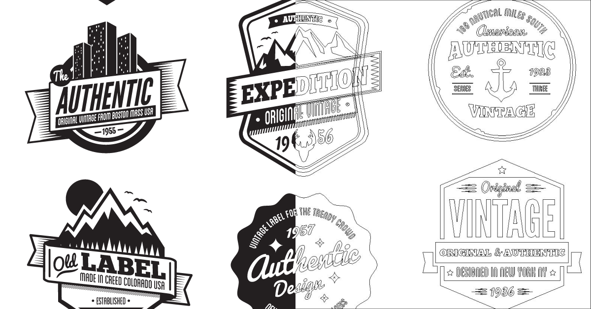
Think of vector art as the “gold standard” for printing. Vector art is very much akin to a drawing, but rather than a pencil, vector art uses coordinates to “draw” the art. The biggest benefit to vector art is that it can be increased in size without losing quality. Often, vector art ends with the file extensions .AI, .EPS, .PDF or .SVG.
Popular Vector Art Editors
- Adobe Illustrator (industry standard)
- Inkscape (free and open source)
- Corel Draw
- Figma (when saved as an .svg)
But be careful: Rasterized images can “live” inside a vector file. If you are unsure, your designer can tell if your file contains a raster image and if it will present any issues. Simply ask!
Color Space, RGB, CMYK and PMS Colors
While not as important as it was several years ago, the color mode in which your art is saved is also important. In today’s design world, unless you are looking for a very specific color match on the final print, color mode usually isn’t an issue.
RGB
Art saved in the RGB color space is designed to be viewed on a monitor, TV or another illuminated display. “RGB” stands for “Red Green Blue,” which are the colors that comprise every pixel on your display. Converting you RGB art to a different color space, such as CMYK, will cause the final printed image’s color to shift. Depending on your project’s requirements, it may be undesirable for the image to be color shifted on the final product. Although this shift may not be noticeable to the untrained eye, sometimes it causes an issue. Your designer will advise you if your RGB art will present any issues.
CMYK
The CMYK color space represents the four ink colors used in traditional full-color printing. “CMYK” stands for “Cyan Magenta Yellow and Key (Black).” Art intended for print and saved in this format will very closely match the final printed piece on a calibrated monitor. While your monitor likely can correctly display the final printed colors, if you are looking for a very specific color, you only should trust two things: your designer’s calibrated monitor or a physical print proof from the printer.
PMS Colors
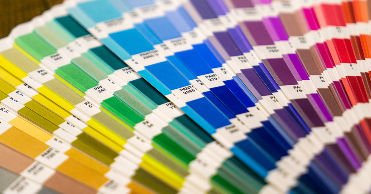
Funny name, but PMS is very serious when printing. PMS is an abbreviation for Pantone Matching System. PMS colors are a universal color/ink scheme, which guarantees that a specific PMS color will accurately match the final printed product. Using PMS colors often can get expensive, depending on the project, as the printer typically must set up their press for that specific color. Unless color is critical, consider the same PMS color, but converted into CMYK.
PMS colors sometimes also are referred to as “spot colors.” Spot color in a full-color print is when a specific ink is used as the fifth color (CMYK + Spot). You’ll often find it is much cheaper to have your art converted to CMYK rather than paying for spot-color printing.
Color Matching
If your project requires very specific color matching, for example, a very specific red for your logo, you should work very closely with your designer. Poor communication in this step of the production process can result in an entire print run being incorrect and ultimately discarded. Color matching is expensive, so experts recommend that you always request a press proof.
My Art Is NOT Print Ready. What Do I Do?
After reading this, you may have realized that your art is not in the format required to print your project and get good results. Don’t sweat it! We know that it’s a lot of technical information to absorb, and after all, design is NOT your field. That’s why you’re smart enough to employ a specialist – a graphic designer – in all things print.
Simply be upfront and honest with your designer, because the fewer surprises, the better your end product will be. For example, tell your designer that all your images came from your website. Your designer will work with you to find solutions. You may have to hire a photographer or spend time to have your logo redrawn to make it print ready. But it’s worth it if your designer produces something that both you and they are proud of! Your designer is an asset to your brand and your business.
As you work with your designer on additional projects, they’re building a library of resources for your business and your brand. They will soon get to know your style, needs and requirements, sometimes even before you begin discussing the full scope of your new project!
An added benefit of working with the same designer is that they will be able to quickly identify design mistakes or make suggestions about your project that help make it more consistent with your brand’s design theme, in fact, slowly building your brand’s style guide. Your brand’s style is what makes you and your brand stand out from the myriad other brands that do the same or similar thing that you do. A very important tool, your style guide helps determine how your brand’s art, logos or assets can be used. Using a style guide ensures that your brand maintains a consistent look and feel, no matter where those assets appear.
Conclusion
To give your graphic designer the best chance of printing a product that you both can be proud of, it’s critical that you provide print ready artwork. Doing so saves lost time and money, and your designer will have the tools to please you and to produce a final printed piece that truly represents you and your brand.
It’s sometimes a tough pill to swallow to discover that your art is of poor quality and could very well lower your project’s ability to make a statement. Do a little homework before you visit your designer and work closely with them. If you work together, it will result in a product that you both can love.

