The last thing a business owner wants to spend all their time on is their public image – or, at least, the image that is present of them on their website. And that is part of the reason why being able to do small things to stand out is paramount given the rapid shift to online or mobile interaction for businesses since the start of the COVID pandemic. Templates are amazing for getting a smoothly operating website for browsing and payments, but very often “unlocking” aesthetic features costs a pretty penny for a small business owner. And in some ways, changing the background of your website to something with wisps and flowers is overdone anyway.
One wants to be welcoming, yes, but is that really a good enough reason to have a pastel blue background on a website selling grills and fireplace supplies? Especially when the tone of your website (with its amazingly written introduction of excitement and flare) doesn’t match the simplistic, vague background. Frankly, it would make me think I’m supposed to be looking at paint swatches, rather than enticing me to get myself the biggest, baddest outdoor grill your website has to offer! So how can you combat the limits of a good structural template for a small business website while still being able to even out the tone of your offerings and their descriptions in a way that’s pleasing to the eye of your many diverse customers?
As strange as it may seem to some, what you need to make your website truly sparkle for you as a small business owner during this rise of online orders is to have a web designer or template for your website’s ease of use, but a graphic designer for everything else. Prices and picture placement and easy sidebar navigation are a must for any website selling products, but do you really want such a simple, outdated website where your customers can only see the amount of money your services and products are worth rather than the effort you’ve put in? Just because websites are sometimes time-consuming to make does not mean a lack of experience with them should prevent your business from soaring to the skies as it’s meant to be doing – nor should it be a reason for younger consumers to consider you “behind the times” as often happens when people are simply unfamiliar with online interfaces rather than unwilling to use them.
Product Do’s and Do NOT’s of Design

First off: product and service websites differ for a reason in their design value strategies, which I will explain here! For products, the emphasis is on the look of the product rather than the information about it at times. Therefore, you want your product pictures to be clear and detailed, preferably with something to act as a size comparison – often when shopping, people can get the idea in their head that something is either very large or very small compared to its actual dimensions, and adding in a sight-reference within your pictures for products that aren’t hand-held can make a world of difference in preventing customers from commenting negatively about the size after they receive your product in the event that it is shippable.
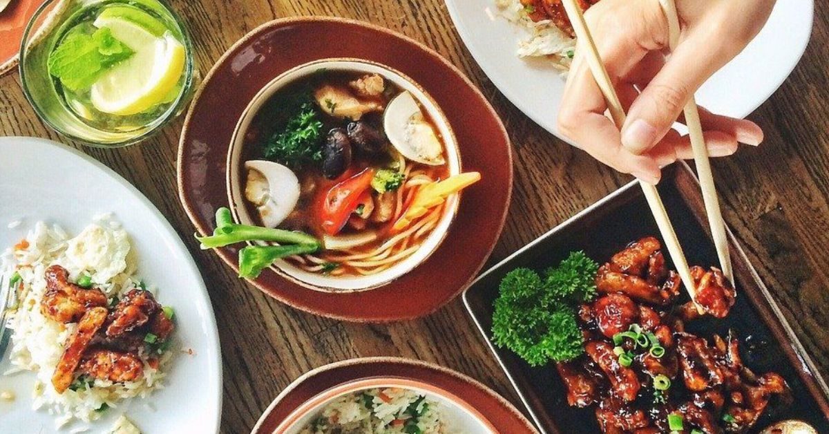
Because of the emphasis on product pictures for selling products online, the background color of a website should be a suitable color of brown or brown-ish red, even reddish-orange could do to bring to mind the idea of “fire” in the mind of a customer on the aforementioned grilling and fireplace website. For a restaurant, though, the products are the food! And often times food is displayed by itself, but I truly believe it would be more beneficial to use the “human interaction” aspect to show off truly good food: have a person’s arms in view to show that some of the entrees you serve are popular and enjoyable! The arms can also act as the previously mentioned size comparison tool. And even better, having a fork or a spoon dipping into or pulling apart a piece of food on the edge can get people much more excited about the idea of eating your food than seeing it perfectly assembled on a plate ever could!
Lastly, I am of the opinion that accent colors being added into the writing itself can be very beneficial to creating a smooth reading experience that keeps consumers “in the moment” of your products. For example, a restaurant known for its sleek wooden flooring and booths might use a darker brown text instead of straight black to accompany a background color of red or brown, making the experience more seamless in terms of color-viewing on the website and showing your attention to detail that will follow over into your food preparation!
I also always find an easy-to-see sidebar that allows the customer to navigate between pages a much better “menu” function than a top bar, which at times makes the first page of a product’s website feel more cluttered with the tendency to look top-down for scrolling.
Shoe-In Service Spoilers
With service websites, the business’s first goal is to “inform” the potential client long before you try to sell them your service. Sprinkling in a bit information on the achievements or some of the more popular services that your particular company provides is fine, but you don’t want a person to be “ready to schedule” a service until after they’ve read about it to avoid confusion and dissatisfaction.
Therefore, writing and infographics are the key to creating a good service business website. Your background should be more simplistic and gentle in this case so that the focus of the first few pages of the website can be on the information it provides. In fact, it’s highly recommended that pricing and scheduling information be a page of their own in this case, so that a person who knows about your business can schedule easily but newcomers will be able to immerse themselves in the atmosphere of your website. Lighter colored backgrounds are good for this: yellows in pastel or light greens and aqua colors can go a long way toward making showing how friendly your website and staff would be in the face of questions by newcomers. It might also be helpful to use “bubble writing” fonts and catchy headers frequently to better separate and make readable each service you provide to help with the intake of information.
A genuinely interesting way to catch one’s attention is to make your infographics “real-life examples.” If possible, have some employees or interns pose in a few of the more confusing infographics and have the pictures edited with arrows to accompany an explanation of your service, such as in a spa resort. In addition, having employees and volunteers in more natural settings, talking or taking a look at some of the more interesting rooms or flashy services you provide in your business would make a good picture to dominate the initial loading space of your about page and give your company a positive, community outlook.
And there we have it! With a bit of personal flair and some special attention, your old website can be revamped to create a whole new experience and draw in customers, or your business can start off with a bang in the heat of the upcoming summer! Take a chance on advice and work with web and graphic designers to make your business the best it can be in every way possible.